A lot of business websites have the same problem: they look finished, but they do not do much. Traffic comes in from Google Ads, SEO, social media, or direct visits, and then it stalls. People browse, hesitate, and leave. That gap is exactly where conversion focused website design matters. It is not about making a site prettier. It is about making the next step obvious, easy, and worth taking.
For SMEs, this matters more than most design trends ever will. If you are paying for traffic or putting time into content, your website should turn that attention into inquiries, bookings, calls, purchases, or qualified leads. If it does not, the issue is rarely one big mistake. It is usually a chain of smaller failures – weak messaging, unclear page structure, slow load times, poor mobile layouts, generic calls to action, and too many decisions for the visitor to make.
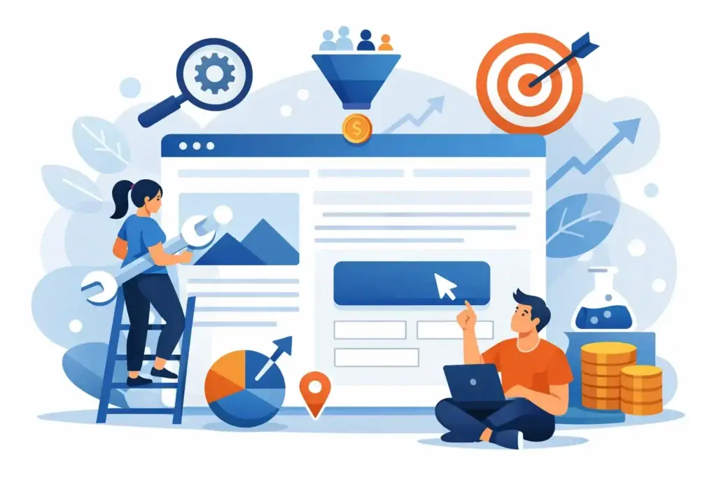
What conversion focused website design actually means
Conversion focused website design starts with one practical question: what do you want the visitor to do on this page? If the answer is vague, the page usually performs poorly. A home page might need to push visitors toward a quote request. A service page might need to generate consultation bookings. A landing page tied to paid traffic might need a form fill. An eCommerce product page might need to drive add-to-cart.
When the goal is clear, design becomes simpler. Layout, copy, visuals, forms, and page flow all support one business outcome. That does not mean every page needs to be aggressive or stripped down. It means every page should reduce friction between interest and action.
This is where many businesses get distracted. They ask whether the site feels modern, whether the animation looks polished, or whether competitors use similar layouts. Those questions are not useless, but they are secondary. If a visitor cannot quickly understand what you offer, who it is for, why they should trust you, and what to do next, the page is underperforming.
Why good-looking websites still fail to convert
A visually polished site can still be weak commercially. This happens often when design decisions are led by internal preference rather than customer behavior. The business likes the wording, the hero banner, or the menu structure, but the visitor is seeing it for the first time and trying to make a quick decision.
The first issue is usually message clarity. Many sites open with broad claims like “trusted solutions” or “quality service”. That kind of copy says very little. A stronger opening tells the visitor exactly what the business does, who it helps, and what result they can expect.
The second issue is navigation overload. If users land on a page and see too many options, attention gets split. More choice feels helpful internally, but externally it often creates hesitation. This is especially costly on mobile, where patience is shorter and screens are smaller.
The third issue is a weak trust layer. Visitors need proof before they act. Depending on the business, that proof may be reviews, client logos, certifications, before-and-after work, case studies, delivery timelines, pricing context, or a simple explanation of the process. Without it, even a clean design feels risky.
Then there is page speed. A slow site kills intent before your offer gets a chance. This is not only a technical problem. Heavy visuals, poor mobile optimization, unnecessary scripts, and bloated templates directly affect conversion rates.
The core elements of conversion focused website design
A conversion-focused page usually gets the fundamentals right before adding anything extra. The headline is clear. The offer is specific. The call to action is visible early. The page answers obvious objections before the visitor has to search for them.
Strong hierarchy matters. People do not read websites top to bottom with full attention. They scan. The page should guide them through a sequence: what this is, why it matters, why you are credible, and what they should do next. If that sequence is missing, visitors are forced to work too hard.
Calls to action need more attention than most businesses give them. “Contact us” is often too generic. In some cases, “Get a quote,” “Book a consultation,” or “Request pricing” sets clearer expectations. The best option depends on buying intent. A high-ticket service may need a softer entry point. A simple service may benefit from a direct ask.
Forms also matter more than they seem. Long forms reduce completion rates unless the buyer already has strong intent. Shorter forms usually perform better for lead generation, but that is not universal. If your sales process requires project scope, budget, or timeline to qualify leads, collecting more information upfront may save time later. The trade-off is lower volume. That is why conversion design is rarely about copying a standard layout. It depends on your sales process.
How traffic source changes the right design approach
Not all visitors should land on the same type of page. Someone clicking a Google Search Ad for an urgent service has different intent from someone reading a blog post or discovering your business through social media.
Paid search traffic usually performs better on pages built around one offer and one action. These visitors already have intent. They need relevance, speed, and confidence. A focused landing page often beats a general website page because it removes unnecessary distractions.
SEO traffic can be broader. Some users are comparing providers, some are learning, and some are ready to inquire. In that case, your page may need to do more educational work before asking for action. The conversion path might include service details, FAQs, proof points, and a secondary call to action for lower-intent visitors.
Social traffic is often colder. That means the design and copy need to create interest quickly. The visitor may not know your brand, may not be actively searching, and may need more context before converting. Here, visual proof and a sharp value proposition carry more weight.
This is one reason channel coordination matters. If your ads promise one thing and your website says another, conversion drops. Good design is not isolated from marketing. It needs to match traffic intent and campaign positioning.
Conversion focused website design is not just about landing pages
Landing pages get most of the attention because they are easier to measure, but the wider website still plays a major role in conversion. Prospects often check other pages before they contact you. They look at your service page, about page, reviews, portfolio, and sometimes your pricing signals.
That means your site needs consistency. If the landing page is sharp but the rest of the site feels outdated or vague, trust weakens. Businesses do not always lose conversions because one page is bad. They lose them because the full buying journey feels uneven.
This is especially true for service businesses with longer sales cycles. An interior design firm, software provider, clinic, or B2B consultancy may not get an instant form fill from the first visit. But that first visit still shapes whether the buyer returns, compares, or reaches out later.
A practical website build should support both immediate demand and future conversion. That means clear service architecture, fast pages, persuasive copy, good mobile performance, and enough proof to reduce doubt across the site.
What businesses should measure after launch
A website is not finished when it goes live. If performance is the goal, launch is the start of testing, not the end of the project.
The first numbers to watch are not only traffic totals. Look at conversion rate, form completion rate, click-through rate on calls to action, cost per lead, bounce rate on key pages, and mobile versus desktop performance. If you are running campaigns, compare traffic source quality. A page may convert well from search and poorly from social, or vice versa.
Behavioral data matters too. Where do users stop scrolling? Which buttons get ignored? Which forms are abandoned? Which pages assist conversions even if they are not the final step? Those patterns show whether your design is aligned with real visitor behavior.
It also helps to separate lead quantity from lead quality. A page that generates more inquiries is not automatically better if those leads are unqualified. In some cases, stronger qualification copy lowers raw conversion rate but improves close rate. That is still a win.
The real standard: can the site help sales happen faster?
The most useful test for conversion focused website design is simple. Does the site help a serious buyer move forward with less friction? If the answer is yes, the design is doing its job.
That usually means the website is clear before it is clever, persuasive before it is decorative, and fast before it is elaborate. It means every major page has a purpose. It means traffic from ads, search, and social is not being wasted on confusion. And it means the website is treated as part of the sales system, not a separate branding asset.
For SMEs, that shift is often where growth starts to become measurable. A better website does not need to win awards. It needs to make it easier for the right visitor to say yes. That is a far more profitable standard to build around.