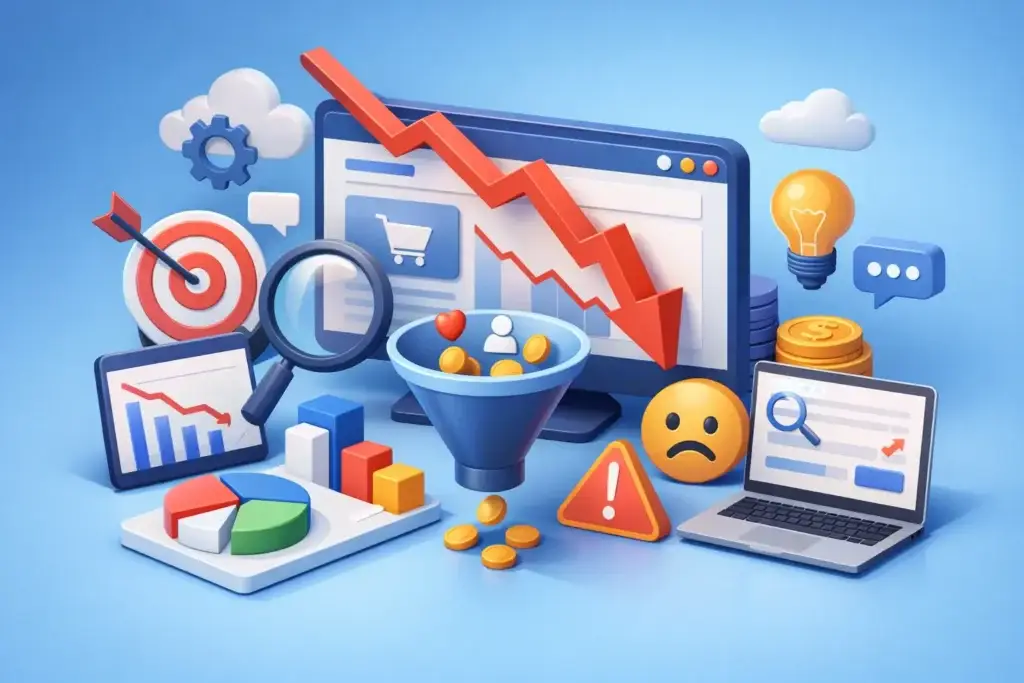
You paid for the traffic. People are landing on the site. Some are even clicking around. But the form stays empty, the calls do not come in, and sales are flat. If you are asking, why is my website not converting, the problem is rarely just design. Most of the time, it is a mismatch between traffic, message, trust, and the action you want people to take.
A website that looks modern can still underperform. A site with strong traffic can still waste budget. Conversion issues usually come from a few operational gaps that compound fast. The good news is that most of them are fixable without rebuilding everything from scratch.
Why is my website not converting if traffic looks fine?
Traffic is not the same as buying intent. A thousand visitors mean very little if the wrong people are arriving, or if the page does not help them make a decision.
This is where many businesses misread performance. They see sessions going up and assume the website is working. In reality, traffic quality matters more than traffic volume. If your SEO content brings in broad informational visitors but your page asks for a high-commitment inquiry, conversion rates will stay low. The same happens when paid ads target keywords with weak commercial intent or social campaigns attract curiosity instead of action.
The first question is not how many people visit. It is whether the page matches what they expected to find. If someone clicks an ad for emergency plumbing and lands on a generic services page, that gap kills momentum. If someone searches for accounting software for small teams and lands on a homepage full of vague brand language, they will leave before they understand the offer.
Your message may be too broad
Most non-converting websites have a positioning problem before they have a technical problem. The site says too much, too vaguely, and too early.
Visitors make a snap judgment within seconds. They want to know three things: what you do, who it is for, and why they should trust you. If your headline is clever but unclear, or your copy tries to speak to everyone, the page creates friction immediately.
Strong conversion copy is specific. It names the problem, frames the outcome, and gives the visitor a reason to continue. That does not mean stuffing the page with claims. It means being direct. A service business should not open with abstract statements about innovation when the visitor really wants to know turnaround time, pricing range, industries served, and expected results.
This is especially true for SMEs. Business owners are not browsing for entertainment. They are trying to solve a problem quickly. If your site does not communicate value fast, they move on.
Your offer may be too weak or too hard to understand
Sometimes the website is clear enough, but the offer itself does not create urgency. Asking a visitor to “contact us” is not the same as giving them a reason to do it now.
Good conversion pages reduce uncertainty. They frame the next step in practical terms. That could be a quote request, a free audit, a pricing consultation, a demo, or a call back within a defined timeframe. The more specific the offer, the easier it is for the user to act.
A weak CTA often signals a weak commercial structure behind the website. If your page does not explain what happens after form submission, how long it takes, or what kind of response the visitor can expect, people hesitate. They do not want to enter a sales black hole.
That is why transparent businesses often convert better. Clear process, realistic timelines, and straightforward expectations reduce risk. This matters more than flashy visuals.
Why is my website not converting even with a nice design?
Because design supports conversion. It does not create it on its own.
A clean website helps, but beautiful layouts cannot rescue poor hierarchy, weak copy, or confusing navigation. In many cases, the more polished the site looks, the more obvious the conversion issues become. Visitors can admire the visuals and still have no idea what to do next.
Look at the page structure. Is the primary CTA obvious above the fold? Does every section move the user toward a decision? Are important details buried under sliders, tabs, or animations? Does the mobile version keep the same clarity, or does it become a compressed mess of oversized banners and tiny buttons?
Design should reduce decision fatigue. If your website gives people too many options, too much text without hierarchy, or multiple competing CTAs, conversions drop. A landing page should not behave like a brochure. It should behave like a sales conversation.
Trust signals are probably missing or too generic
People do not convert when they feel unsure. That uncertainty may be about your credibility, your delivery quality, your legitimacy, or your fit for their needs.
Many websites try to solve this with generic testimonials and broad claims like “trusted by many clients.” That is not enough. Trust works best when it is concrete.
Case studies, recognizable client logos, review snippets, certifications, before-and-after results, pricing transparency, team visibility, and clear service scope all help. The right trust signal depends on your business model. A local service company may benefit from reviews and location credibility. A B2B lead generation site may need process clarity and proof of outcomes. An eCommerce store may need shipping, returns, and payment reassurance.
There is also a timing issue. If trust elements appear too late, many visitors never reach them. The most important proof should show up early, not hidden near the footer.
The page may ask for too much, too soon
A common conversion killer is commitment mismatch. The visitor is still evaluating, but the page asks for a major leap.
If someone has just discovered your business, asking them to book a one-hour consultation or fill out a twelve-field form may be too aggressive. If the form asks for budget, company size, timeline, and several open-text responses before the person even trusts you, abandonment goes up.
This is where funnel thinking matters. Not every page should push the same conversion action. Some pages should collect a softer lead. Others can support high-intent actions. It depends on traffic source, awareness stage, and service complexity.
For example, branded search traffic often converts better on direct inquiry CTAs. Colder traffic from SEO or paid social may need a more educational path first. One reason AdCendes emphasizes coordinated channel strategy is that conversion performance depends heavily on matching page intent to acquisition intent.
Speed, mobile usability, and technical friction still matter
Not every conversion problem is strategic. Some are operational and expensive.
If your site loads slowly, breaks on mobile, fires annoying pop-ups, or has forms that fail silently, users leave. Mobile performance is especially critical because many businesses still review desktop pages while most visitors come from phones.
Check the basics. Are buttons easy to tap? Is text readable without zooming? Does the sticky header consume half the screen? Does the CTA remain visible? Does the page load quickly enough on standard mobile data, not just office Wi-Fi?
Technical friction also includes analytics problems. If conversion tracking is broken, you may be optimizing the wrong pages or channels. Many businesses think the website is underperforming when in fact leads are not being attributed properly. Others assume paid traffic is poor when organic or referral traffic is the real issue. Without clean tracking, decisions become guesswork.
Your website may be attracting the wrong audience
This is a bigger issue than most teams realize. A low-converting website is often a symptom of poor targeting upstream.
If your SEO content is built around high-volume keywords with weak purchase intent, visitors will come but not act. If your Google Ads campaign goes after broad terms to maximize clicks, lead quality drops. If your social media content builds awareness without filtering for fit, the site becomes a catch-all for low-intent users.
That does not mean top-of-funnel traffic has no value. It means you need the right page strategy for each audience. Informational traffic should land on content that educates and qualifies. Commercial traffic should land on pages built to convert. Sending every visitor to the homepage is usually a waste.
How to fix a website that is not converting
Start with evidence, not opinions. Review heatmaps, form analytics, conversion paths, source quality, bounce behavior, and mobile performance. Then audit the page in this order: message clarity, offer strength, CTA visibility, trust signals, page friction, and traffic fit.
Do not change ten things at once. Fix the obvious bottleneck first. If the headline is unclear, rewrite that before redesigning the entire page. If the form is too long, shorten it before changing ad targeting. If paid traffic is mismatched, solve that before blaming the website alone.
The goal is not more activity. It is fewer leaks.
A practical test is simple: can a first-time visitor understand your offer in five seconds, trust you in thirty seconds, and take the next step in under a minute? If not, the site is working harder than it needs to.
The best converting websites are rarely the most complicated. They are clear, credible, and aligned with intent. If your site is not converting, that is not a sign to panic. It is a sign to get sharper about what the page promises, who it is for, and what happens next.
Small changes in those areas can produce a bigger revenue lift than a full redesign ever will.